Almost all of the web projects I work on use a CSS pre-processor and of one of the main advantages of using one is the ability to use variables. Colours, hex or codes or otherwise, are usually one of the first pieces of repetitive code to be abstracted into variables because they’re hard to remember; when you’re trying to get stuff done you don’t want to keep looking up 6 character references, hues or luminosities.
In many of the Sass or LESS projects I’ve worked on a second layer of abstraction is also added to map the colour palette to variables which better describe their uses in an effort to avoid the potential pitfalls of being too specific:
// Neutral color palette
$palette-neutral--xdark:  #2C3643;
$palette-neutral--dark:   #3B444F;
$palette-neutral--base:   #67747C;
$palette-neutral--light:  #99A9B3;
$palette-neutral--xlight: #DBE6EC;

// Primary color palette
$palette-blue--dark:  #1D508D;
$palette-blue--base:  #206FAC;
$palette-blue--light: #288AD6;
$palette-red:         #FA5E5B;
$palette-green:       #16C98D;
$palette-orange:      #FFC83F;
$palette-yellow:      #FEEF6D;

// Color uses
$color-bg:                $palette-neutral--xlight;
$color-text:              $palette-neutral--xdark;
$color-nav:               $palette-blue--dark;
$color-nav--hover:        $palette-blue--base;
$color-link:              $palette-blue--base;
$color-link--hover:       $palette-blue--light;
$color-contrast--bg:      $palette-neutral--dark;
$color-contrast--text:    $palette-yellow;
Usually these two steps are as far as project colour management goes, there are arguably smarter ways of doing it but the basic conventions suit many cases.
I think colour management can go one step further and specify the relationship between colours, a process which I’ve been calling themes. The implementation of the themes idea has been made very simple with the release of Sass 3.3 which introduced the Map data structure and associated functions. Themes are just a maps defining a name and the associated colours:
// Themes
$themes: (
  brand: (
    primary: $palette-blue--base,
    secondary: $palette-blue--dark,
    contrast: $palette-yellow
  ),
  highlight: (
    primary: $palette-yellow,
    secondary: $palette-orange,
    contrast: $palette-neutral--dark
  ),
  neutral: (
    primary: $palette-neutral--light,
    secondary: $palette-neutral--xlight,
    contrast: $palette-neutral--xdark
  )
);
My original implementation of the themes idea was for a site which used different arrangements of the colour palette for different sections of the site but I think it’s a useful technique to use on any project, the majority of which will provide multiple variations for basic elements and components.
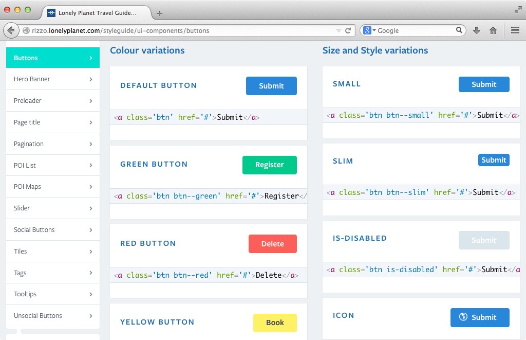
At Lonely Planet many of our components come in a variety of colour variations.
A client’s brand guidelines or your team’s designer will always tell you that only certain colours should be used together, a predominant colour will often have a complimentary and contrasting colour. Defining these rules in one place not only prevents duplication throughout the codebase but aids a common language between designers and developers. The single point of reference means non-developers can easily jump in and confidently make tweaks.
The aspect of this technique which really appeals to me though is that it can keep stylesheets really DRY which should aid maintainability in future. For example, simple text variations can be defined dynamically:
// Text color variations
@each $name, $theme in $themes {
  .text--#{$name} {
    color: map-get($theme, primary);
  }
}
And variations for more complicated, stateful components can be kept really terse without creating stylesheets that lose coherency:
// Button base
.btn {
  padding: 0.5em 1em;
  border-radius: 4px;
}

// Button color variations
@each $name, $theme in $themes {
  .btn--#{$name} {
    color: map-get($theme, contrast);
    background: map-get($theme, primary);

    &:hover {
      background: map-get($theme, secondary);
    }
  }
}
CSS pre-processors can make working with colours much easier over the lifetime of a project and this is just another little technique that takes advantage of the extra power. Let me know what you think about defining the relationships between colours in the comments below or check out an example.